Arts & Culture
The old choice of a new generation
Brandcenter Executive Director Vann Graves explains why design history is repeating itself
Years ago, shortly before he quit his Manhattan ad job to join the Army infantry after 9/11, and well before he took over as the VCU Brandcenter’s executive director in 2018, Vann Graves, Ed.D., helped design a Pepsi logo.
“The one I worked on, it’s all that 3D-extra stuff,” says Graves, who spent 15 years at BBDO, the 1891-founded ad agency that inspired the fictional Sterling Cooper firm in “Mad Men.” BBDO even cameoed in the show. “It’s dated, but not in a nice way. It’s dated like 1970s bell-bottoms, not ooh, wow, I wish I had a classic DeLorean.”
Graves is referring to the globe logo the soda company used from 1998 to 2007. It looks very much like it was designed in 1998, a fact that, today, renders it the choice of no generation. And even the most recent Pepsi logo — that 2008- introduced minimalist circle angling Pepsi’s stripes like boat sails — has lost its freshness amid technology burnout and growing nostalgia for analog times.
“It’s part of a trend of everyone going back to their roots,” Graves says. “You notice Millennials, Gen Z, Generation X — everybody wants vinyl records again.” (In 2022, people bought 41 million vinyl records, the most since 1988 when CDs overtook vinyl.) “It is because everything is too perfect and feels too inorganic.”

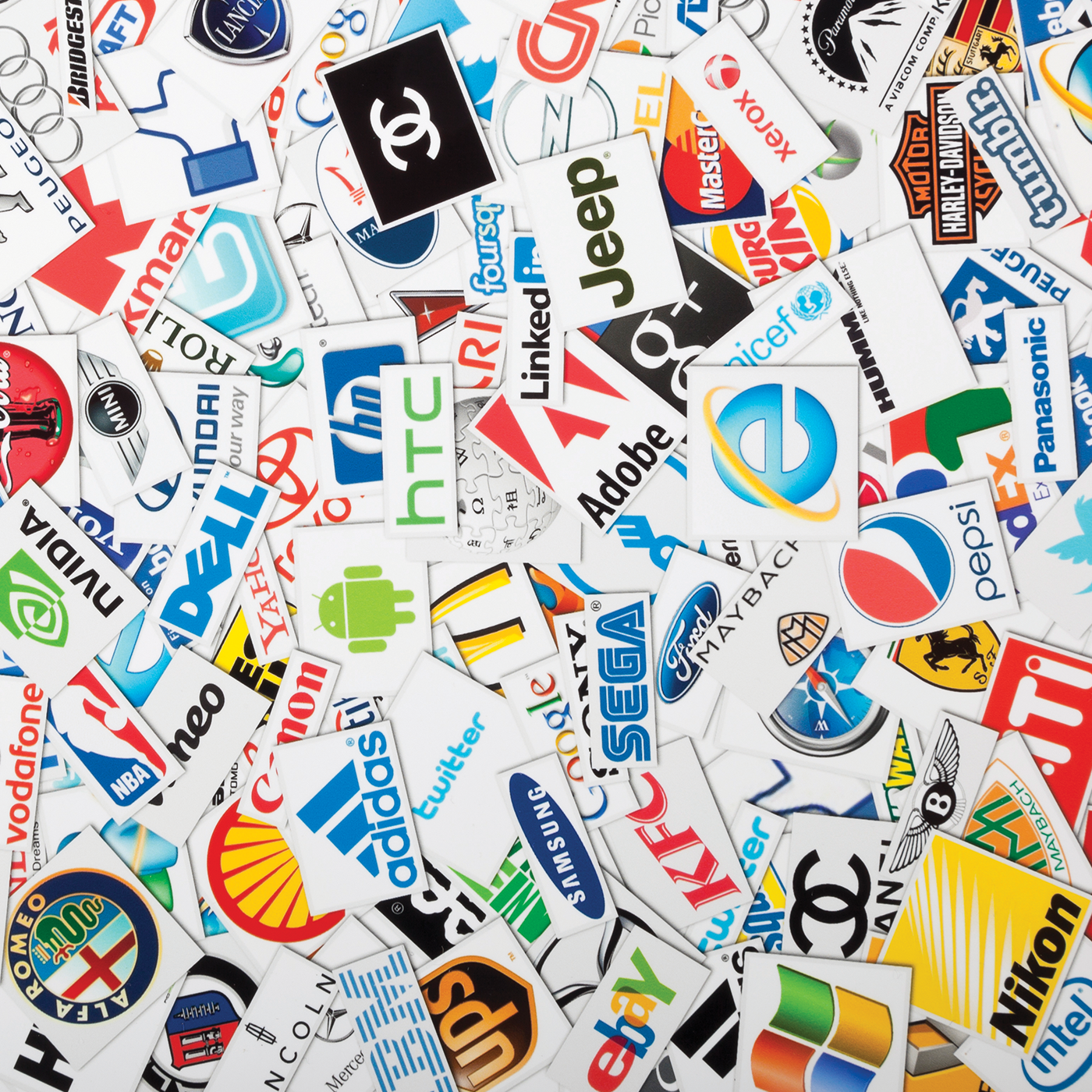
Vann Graves. (Courtesy of VCU Brandcenter)
Taking a stab at reinvigoration, Pepsi this fall debuted a new logo, redolent of the classic bottle cap design introduced in 1950 and updated in 1986.
“You really want today something that’s simple, clean, recognizable,” Graves says. “It goes back to simplicity and familiarity. No one would know the Nike swoosh, except for the fact that [Nike uses] the Nike swoosh.”
Before the bottle cap, Pepsi had a script logo for the first half of the 20th century because, Graves says, script is how most people wrote. It was familiar, just like the bottle cap to those of a certain era.
“Everybody knew what that was. They knew that sound. They knew that feel,” Graves says of opening a bottle. “And then when you get to ’87 to ’97, well, now you’re dealing with cans and so that [bottle cap] icon might not work. It’s like today if you use a regular telephone, most of the kids would be like, ‘What is that?’ right? And so it became an irrelevant part of the mark.”
Pepsi’s newest logo fits within an on- going minimalist trend, driven partly by the design demands of digital use. Logos must be readable at ever-changing siz- es, able to stretch between the big glow screens in our living rooms and the little glow screens in our hands. Mostly abandoned are shadows, elaborate fonts and lots of colors, three-dimensionality, all things that are hard to read in teeny sizes. Back in are the basics. Clean lines, matte colors and flatness abound.
In 2022, Canada Dry, Visa and the Minnesota Twins all went sleek and spare. So did the Girl Scouts and M&Ms. In 2021, Burger King went clean and vintage, reintroducing the logo it used in the ’70s, ’80s and ’90s. Seven years before that, Miller Lite did the same thing (and saw a sales boost). Now Pepsi’s invoking its most enduring look.
“I really do think that we’re in a phase now where simplicity, classic tactile connections, simplicity in vision from a visual standpoint are important,” Graves says. “We’ve got AI. We’ve got 3D media. We’ve got all these things, but you get one of those throwback things, it takes you to that moment that takes you to a simpler place, in a simpler space, and I think brands now want to rely on that warm feeling of the past.”
