Campus & Community
How branding changed college sports logos
Brandcenter Executive Director Vann Graves explores VCU’s look through the decades
VCU Brandcenter executive director Vann Graves, Ed.D., says the philosophy of college sports logo design began to change in the 1980s, thanks in part to the exposure that came with more games being broadcast on regional and national television.
“You started to see this kind of blending and understanding of: We can market through our sports teams,” Graves says. “The more money that got put into the sports teams — just as much as [into] research in some schools, especially — that was, I think, the turning point of how folks started looking like, OK, so we’re getting more recognition for these wins than we are for the research. We need to leverage both.”
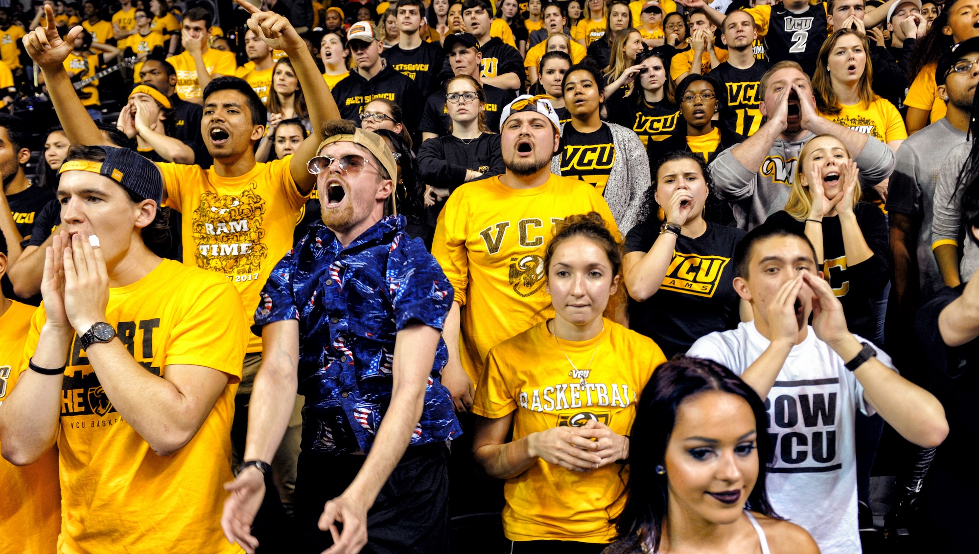
At VCU, the men’s basketball team’s 2011 Final Four run led to an application and enrollment surge, and the day VCU beat Kansas to make the Final Four, “Virginia Commonwealth University” was Google’s top search trend.
VCU’s Final Four loss to Butler averaged 14.2 million TV viewers, which helped make the 2011 Final Four broadcast the highest rated since 2005.
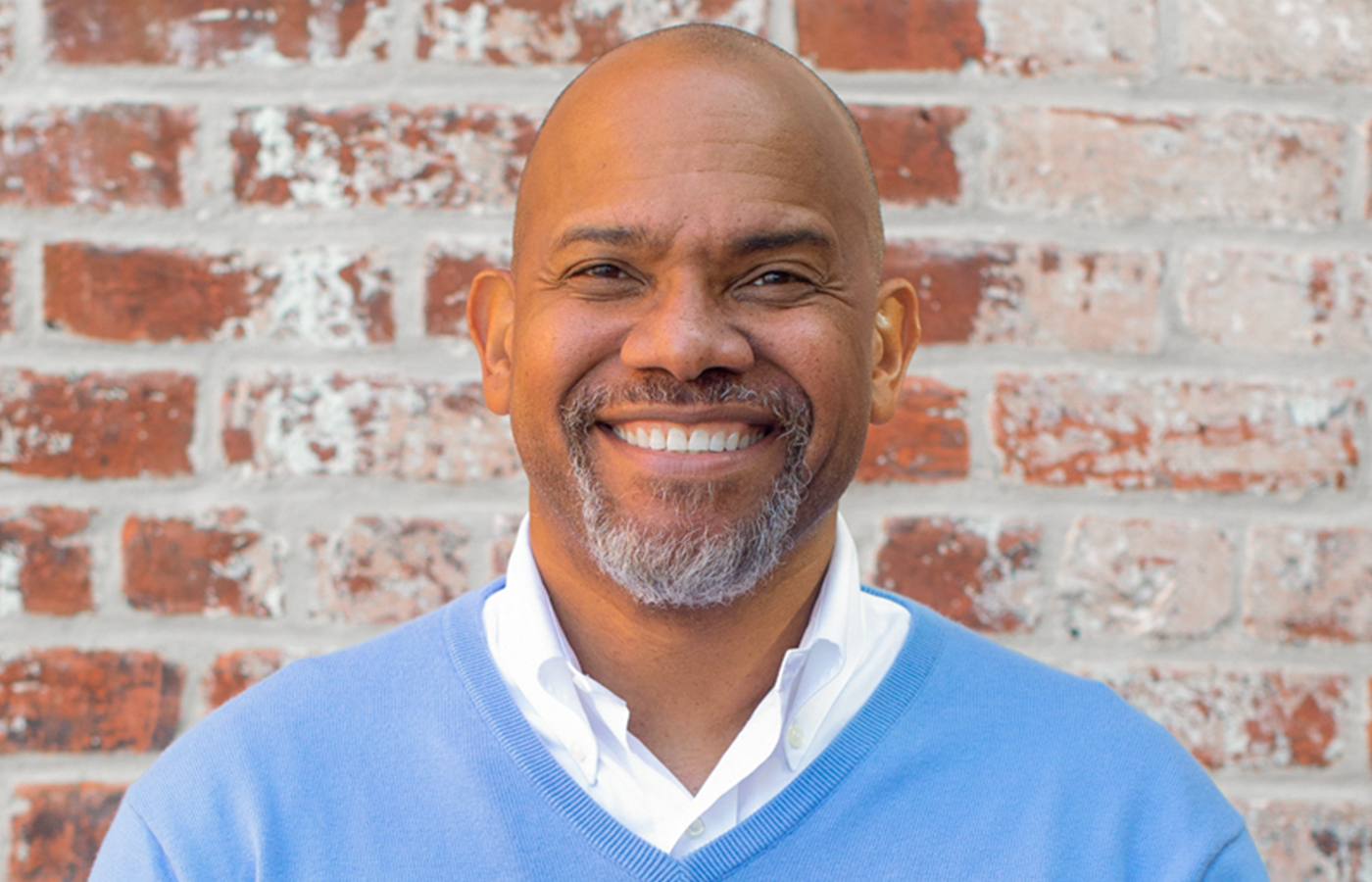
Vann Graves. (Courtesy of VCU Brandcenter)
“The reality is people love sports,” Graves says. “There are people who’ve never gone to VCU, but they still support the Rams. They will come to the games religiously. This is their hometown team. So it’s not just talking to the people who spent four years here or eight years here, six years. It speaks to people who are part of a community in a way research and academics don’t. Research and academics will never touch the feeling that people get when their team wins.
“Sports hit at the hearts and minds of people. Again, in the ’80s, especially, people started really focusing on sports as a brand, and how do we leverage that? Now, it’s down to a science.”
Here, Graves examines VCU’s sports logos through the years and explains how design philosophy grew from just differentiating teams to representing institutions.
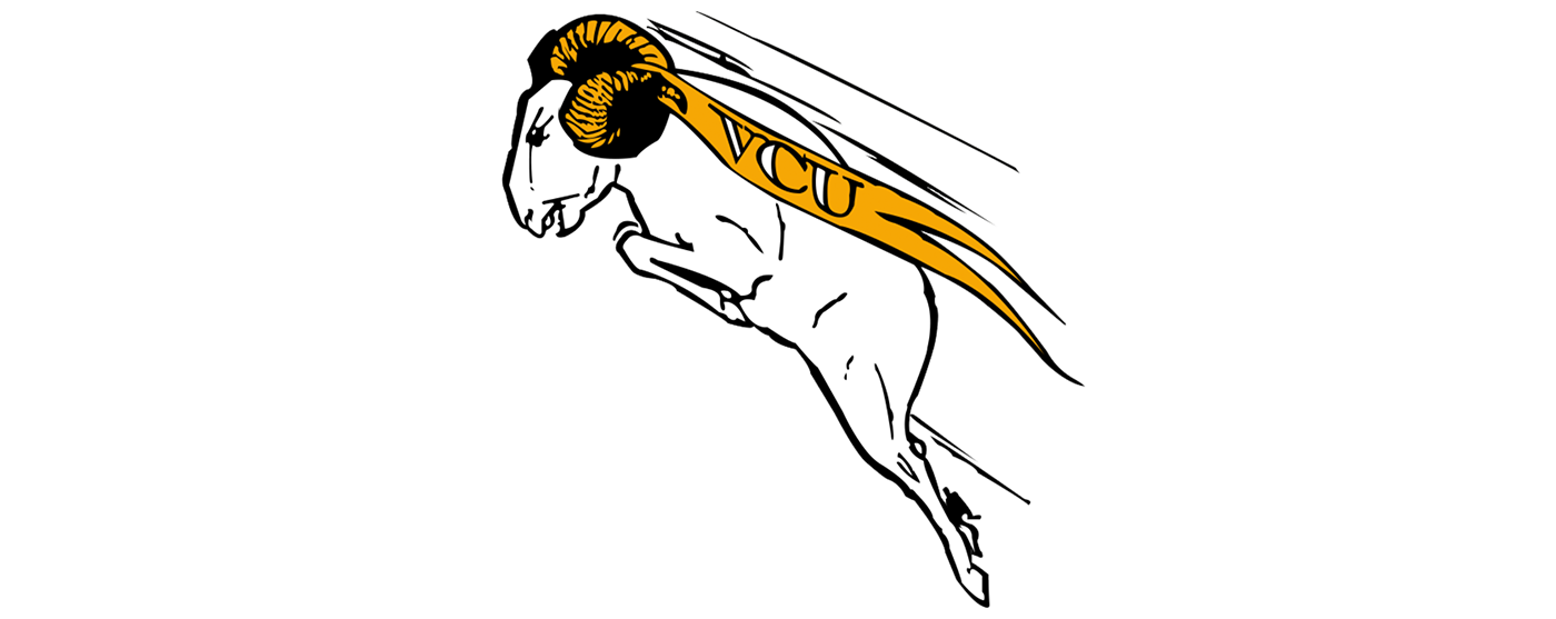
1968-82
It’s on brand for the era because you’ve got this full-body ram. Very rarely do you have the full body in motion anymore, but also [we have] the pennant, which is also a classic ’60s thing. They did all the things with this logo. They put everything in here they possibly could to show it’s an active logo. It’s not static. They also wanted to show — “aggression” might not be the right word, but show the movement or the energy around VCU and the forward motion and forward momentum. What is interesting, though, is folks nowadays don’t show momentum moving to the left. It’s always going to the right. That’s just kind of a standard design thing, where things are shooting to the direction that you read, from left to right, and this is going right to left.
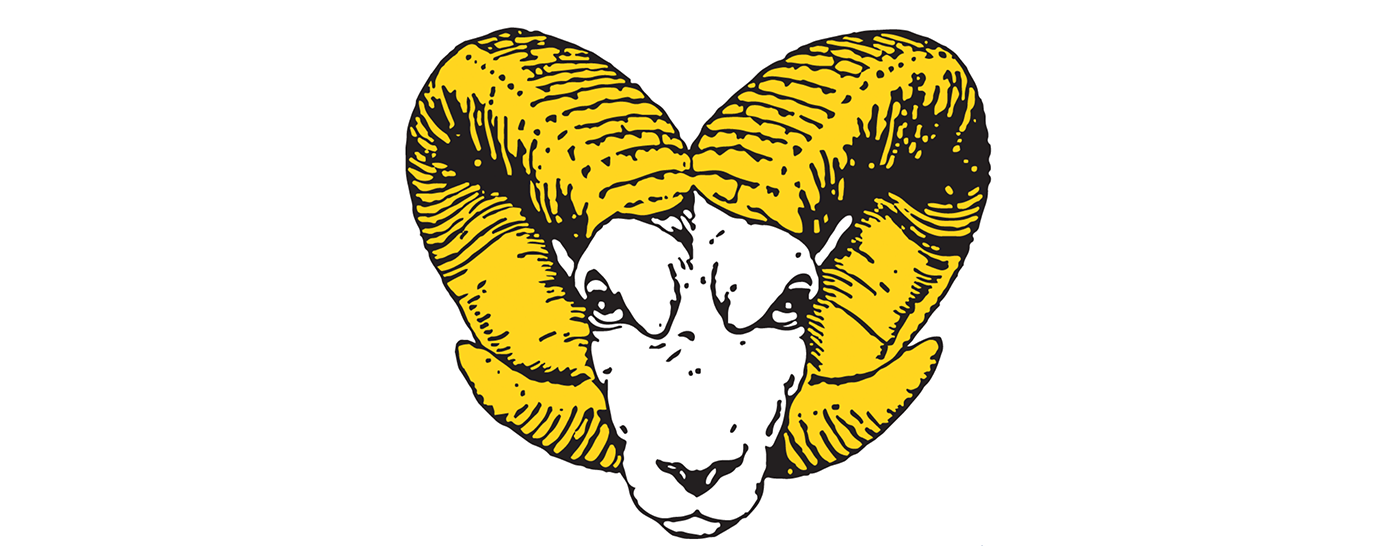
1982-89
When you go into the ’80s, you can tell someone was like, “OK, we need to simplify this, get all the bells and whistles out, we’re entering into a new era.” It actually feels late ’70s to me, which is probably when the [redesign] conversations were happening. But it’s very classic and has a richness of design — much more detail. And again, like the previous one, it’s hand-designed, and I would almost put my money on it that they used someone who had a history of doing design for a newspaper. The inking just looks so specific and just so tightly done — beautifully done. … They’ve moved from simplicity to such detail. Look at the ram’s face. I used the term “aggression” earlier, but you can see the fierceness in the eyes. That’s detail. That’s style. I mean, there’s a snarl there that’s just enough. Someone cared about this design. This one more so than the previous one feels like it would be on a 1920s football uniform.

1989-2003
This is the first time someone’s like, “Oh, we got a computer.” Not a judgment, but an observation. It’s like, “OK, we want VCU to be represented.” I don’t think it’s as effective as it could be. There is a V back there, and I’m wondering if the horn in this one is meant to be the C. And then I don’t see the U and I’m kind of looking for that. This one just seems busier to me and less elegant — but it’s simpler in its design. I feel like this is much more utilitarian and functional. This logo is like, “OK, this new one really needs to do the work for us of ‘What are we going to put on our uniforms?’”
2003-14
I feel like the assignment was: We need to be very clear on VCU. We like the Ram and the way it’s built, still having the fierceness that the previous two had to show that energy. This graphic is very much early 2000 sports. It’s kind of picking up a modern, more professional sports design.

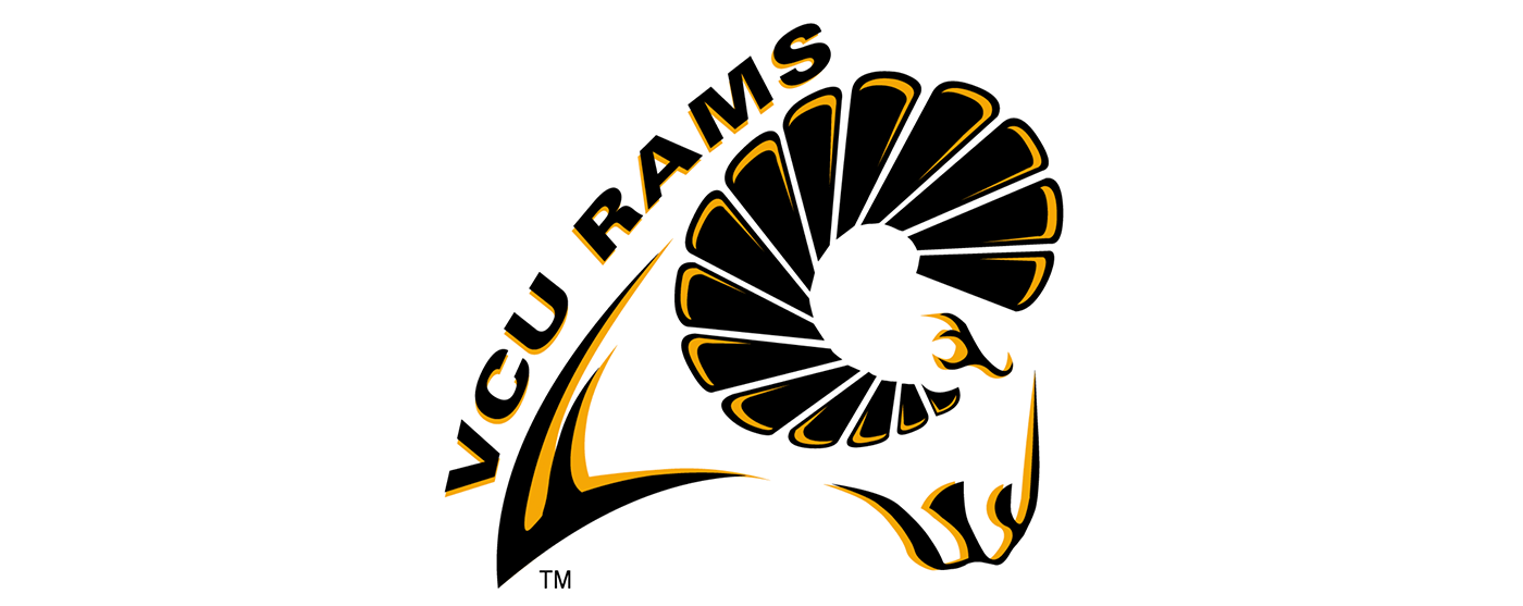
2014-present
We’ve lessened the idea of the ram, just using an allusion or a nod to the ram’s horn, and again having the movement of the logo, still showing that energy left to right. It’s simple, it’s clean, and at this point, you don’t have to establish VCU as the Rams. Everyone knows the Rams. We’ve got a lot of other ways of telling this story without being as literal as we have been historically.
As we start looking at 2014 to present, it is not only design, but it’s marketing and branding execution around this idea “We’re no longer a local school, we’re no longer a commuter school — we’re a national school with a national presence.” People may not know who the Rams are, but they know who VCU is. We’re one VCU now because our brand has become that. There’s no MCV, there’s VCU Health. There’s VCU proper, there’s VCU athletics. It’s all under the VCU brand. We’ll always be the Rams, but the focus from a branding standpoint, from your major or key logo, it’s going to be a nod to the Rams — using this horn at the end of the V — but it’s not all about the Rams. It’s a part of that portfolio of what VCU is and what VCU’s offerings are.
